Building a Client SEO Dashboard in React
When a web or SEO agency hands a client a report, the report is the product as far as the client is concerned. It is the one artifact they look at every month, the thing they forward to their boss, the evidence the retainer is worth paying. A spreadsheet says “we did some work.” A clean, fast, well-built dashboard says “these people sweat the details.” The medium is part of the message.
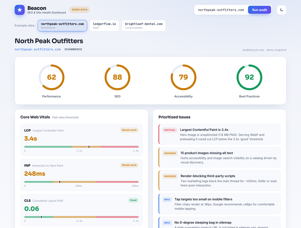
So we built one as a reference piece: Beacon, a single-page SEO & Core Web Vitals dashboard in React. It takes a site, runs an “audit,” and lays out performance scores, Core Web Vitals, an on-page SEO checklist, keyword movement, and a prioritized issues list. You can try the live demo or read the source on GitHub. The data in the demo is illustrative — the interesting part is the front-end engineering, which is what this post is about.
One self-imposed rule: no chart library
The reflex on a dashboard is to npm install a charting library and move on. We deliberately did not. A general-purpose chart library is a large dependency that ships a layout engine, a tooltip system, an animation runtime, and a dozen chart types you will never render — all to draw four progress rings and a few threshold bars. On a tool whose entire pitch is “we care about performance,” pulling 150 KB of JavaScript to draw a circle is the wrong look.
SVG is a first-class part of the platform. A progress ring is a circle with a stroked outline and a clever use of stroke-dasharray. Drawing it by hand is less code than configuring a library to do it, animates with plain CSS, and gives you total control over every pixel — which, on a client deliverable, is the whole point.
The score ring
Each of the four scores (Performance, SEO, Accessibility, Best Practices) is a circular gauge that fills from zero to its value and is colored by threshold — green at 90+, amber at 50–89, red below. The trick is that a circle’s stroke can be turned into an arc by setting its dash to the full circumference and then offsetting the dash by the fraction you want to hide.
function ScoreRing({ value, label }) {
  const R = 54;
  const C = 2 * Math.PI * R;                 // circumference
  const offset = C - (value / 100) * C;      // hide the unfilled part
  const tone = value >= 90 ? "good" : value >= 50 ? "warn" : "poor";

  return (
    <figure className={`ring ring--${tone}`}>
      <svg viewBox="0 0 120 120" role="img" aria-label={`${label}: ${value}`}>
        <circle className="ring__track" cx="60" cy="60" r={R} />
        <circle
          className="ring__value"
          cx="60" cy="60" r={R}
          strokeDasharray={C}
          strokeDashoffset={offset}
          transform="rotate(-90 60 60)"        /* start at 12 o'clock */
        />
      </svg>
      <span className="ring__num">{value}</span>
      <figcaption>{label}</figcaption>
    </figure>
  );
}
The animation is entirely CSS. The value circle gets a transition on stroke-dashoffset; on mount we render it empty (offset equal to the full circumference) and then set the real offset on the next frame, so the browser tweens the fill. No animation library, no requestAnimationFrame loop, no React state churn — the GPU does the work and it stays smooth even with four rings animating at once.
.ring__value {
  transition: stroke-dashoffset 900ms cubic-bezier(.22,.61,.36,1);
  stroke-linecap: round;
}
.ring--good .ring__value { stroke: var(--good); }
.ring--warn .ring__value { stroke: var(--warn); }
.ring--poor .ring__value { stroke: var(--poor); }
@media (prefers-reduced-motion: reduce) {
  .ring__value { transition: none; }
}
That prefers-reduced-motion block is not decoration. A dashboard that animates aggressively can be genuinely unpleasant for some users, and honoring the OS-level setting is a one-line accessibility win that most dashboards skip.
Core Web Vitals, scored honestly
The Core Web Vitals panel is where domain knowledge matters more than rendering. Google publishes specific thresholds, and a tool that gets them wrong is worse than no tool. The buckets are: LCP good at ≤ 2.5 s and “needs improvement” up to 4 s; INP good at ≤ 200 ms, up to 500 ms; CLS good at ≤ 0.1, up to 0.25. We encode the thresholds once and derive the status, rather than hard-coding labels:
const VITALS = {
  lcp: { label: "LCP", unit: "s",  good: 2.5, poor: 4.0,  fmt: v => v.toFixed(1) },
  inp: { label: "INP", unit: "ms", good: 200, poor: 500,  fmt: v => Math.round(v) },
  cls: { label: "CLS", unit: "",   good: 0.1, poor: 0.25, fmt: v => v.toFixed(2) },
};

const rate = (metric, v) =>
  v <= VITALS[metric].good ? "good"
  : v <= VITALS[metric].poor ? "needs-improvement"
  : "poor";
Each metric renders its value, a colored status pill, and a small horizontal bar with the good/needs-improvement boundaries marked, plus a dot showing where the measured value falls. That little bar does more for comprehension than the number alone — a client who does not know what “CLS 0.18” means can see at a glance that the dot sits in the amber zone, just shy of green.
Responsive without a UI kit
No Bootstrap, no Tailwind, no component library — just CSS Grid, custom properties, and a couple of real breakpoints. The dashboard’s top region is a grid that reflows from four columns to two to one as the viewport narrows:
.scores {
  display: grid;
  grid-template-columns: repeat(4, 1fr);
  gap: clamp(12px, 2vw, 24px);
}
@media (max-width: 880px) { .scores { grid-template-columns: repeat(2, 1fr); } }
@media (max-width: 460px) { .scores { grid-template-columns: 1fr; } }
The one rule that prevents most “why is my grid blowing out on mobile” bugs is giving grid and flex children a min-width: 0. By default a grid item will not shrink below the intrinsic width of its content, so a long unbroken string — a URL in the keyword table, say — forces the whole column wider than the viewport and you get a horizontal scrollbar. min-width: 0 plus overflow-wrap: anywhere on the cell lets it wrap instead. We verified zero horizontal overflow at 390 px by asserting scrollWidth === clientWidth in a headless browser, which is the only way to actually trust it.
A theme system that never flashes
Light/dark is table stakes now, but the detail that separates a polished implementation from a janky one is the flash — the white blink before the saved dark theme applies. The fix is to set the theme before first paint, with a tiny inline script in the document head that reads localStorage and sets a data attribute on <html> synchronously:
// inlined in index.html, runs before the app mounts
(function () {
  const saved = localStorage.getItem("beacon-theme");
  const sysDark = matchMedia("(prefers-color-scheme: dark)").matches;
  document.documentElement.dataset.theme = saved || (sysDark ? "dark" : "light");
})();
Every color in the app is a CSS custom property defined twice — once under :root[data-theme="light"] and once under dark. The React toggle does nothing but flip the attribute and persist the choice; the cascade does the rest. Because the colors are variables, the SVG rings, the status pills, the threshold bars, and the table all re-theme together with no per-component logic.
The dashboard practices what it preaches
There is a credibility trap in shipping a performance tool that is itself slow. Beacon is a Vite build with a deliberately small dependency footprint — React and not much else — so the production bundle is tiny and the app is interactive almost immediately. The score rings reserve their space before they animate, so there is no layout shift as they fill; the page’s own CLS is effectively zero. It would be embarrassing to lecture a client about their Largest Contentful Paint from a dashboard that took three seconds to show a spinner.
About the data
To be straight about it: the demo runs on bundled sample datasets for a few fictional sites, not a live crawl, and it says so in the UI. That is a deliberate scoping choice for a public portfolio piece — it keeps the demo free, instant, and dependency-free, and it puts the spotlight on the front-end work. The data layer is a single module behind a clean shape; wiring it to a real source (the PageSpeed Insights API, a crawler, a rank-tracking provider) is a back-end swap that does not touch a single component. Honest demo data beats a fragile live integration that rate-limits the moment someone shares the link.
The takeaway
A client-facing dashboard is a front-end craft exercise as much as a data one. The things that make Beacon feel finished are unglamorous: drawing the gauges by hand instead of importing a library, encoding the Core Web Vitals thresholds correctly, getting the responsive grid to never overflow, killing the theme flash before first paint, and keeping the tool itself fast. None of that needs a framework-of-the-month. It needs React, modern CSS, SVG, and attention to detail.
That is the kind of front-end work we do — responsive, fast, pixel-careful interfaces that hold up in front of a paying client. If that is what your team needs, the source is on GitHub and the demo is one click away.